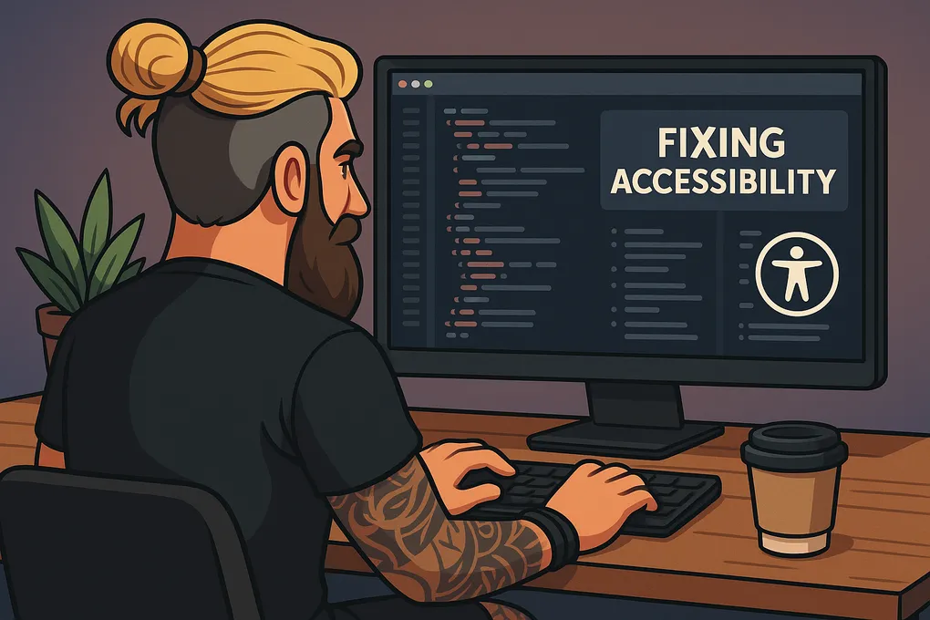
Accessible CSS: Small Tweaks That Make a Big Difference
How to write CSS that supports users properly, not just ticks boxes.
A lot of devs still treat accessibility like it’s just about screen readers and ARIA tags. But the way you write your CSS makes a massive difference too. It affects how people see, use, and navigate your site, especially folks with low vision, ADHD, colour blindness, or anyone using zoom or dark mode.
This is a quick, no-nonsense guide to writing CSS that’s more accessible. It’s not about being perfect, just about being a bit more thoughtful with the code you already write.
1. Use rem, or even better, clamp() for font sizes
Setting text in px ignores the user’s font preferences. If someone bumps up their browser font or zooms in, nothing changes, and your layout falls apart.
Using rem is a good start, but clamp() gives you flexibility without relying on media queries.
body {
  font-size: clamp(1rem, 1.5vw, 1.25rem);
}
That means:
- It won’t go smaller than
1rem - It scales a bit based on screen width
- It stops growing after
1.25rem
It’s just a better, more future-proof way of handling type. And it still respects system settings.
2. Don’t override high contrast or forced colours
Avoid things like this:
* {
  background: white !important;
  colour: black !important;
}
That sort of thing breaks forced colour modes that some users rely on, especially on Windows. You might think it looks cleaner, but it can leave people with invisible content.
Let the browser and OS do their job. If someone’s using high contrast mode, it’s for a reason.
3. Colour isn’t enough on its own
If you’re using red for errors or green for success, make sure you’ve got something else to back it up. A border, icon, label, anything visual that doesn’t rely on colour alone.
input.error {
  border: 2px solid #b20000;
}

input.error::after {
  content: "⚠ Error";
  colour: #b20000;
  font-weight: bold;
  margin-left: 0.5rem;
}
That way, someone who’s colour blind or using a grayscale screen still gets the message.
4. Make focus states visible
Don’t remove outlines just to make things look nicer.
Bad:
button:focus {
  outline: none;
}
Better:
button:focus-visible {
  outline: 3px solid #0077b6;
  outline-offset: 2px;
}
If you don’t want the focus ring showing up on mouse click, use :focus-visible instead of :focus. It only kicks in when using a keyboard.
5. Don’t set fixed heights on anything with text
Fixed heights break things when users zoom in. Text gets cut off, overlaps, or overflows.
Instead of this:
.card {
  height: 200px;
}
Try:
.card {
  min-height: 200px;
  padding: 1.5rem;
}
Let your layout breathe. It’ll adapt better for screen readers, large text, and different languages too.
6. Test your zoom levels
Your site should still work at 400% zoom without needing horizontal scrolling. That’s part of WCAG 2.2.
To make that happen:
- Use
max-widthnot fixedwidth - Avoid
overflow: hiddenunless it’s intentional - Zoom in and tab through your page regularly
If something breaks, fix it early. It’ll help everyone, not just screen magnifier users.
7. Respect reduced motion preferences
Some people get dizzy or disoriented from animations, especially flashy transitions or things that slide around.
@media (prefers-reduced-motion: reduce) {
  * {
    animation: none !important;
    transition: none !important;
  }
}
You don’t need to kill all animations, just give users the choice to turn them off if needed.
8. If you’re doing dark mode, test it properly
Dark mode isn’t just about flipping colours. You need enough contrast between your text, backgrounds, and UI elements so they’re still readable.
Check that:
- Text isn’t grey-on-grey
- Inputs, buttons, and links are still clear
- You’re not relying on background colour for context
Use a tool like WebAIM Contrast Checker or Colorable to double-check your values.
Final thoughts
Accessible CSS isn’t about fancy techniques or frameworks. It’s just about writing styles that don’t trip people up.
If your layout breaks at 150% zoom, if your buttons have no focus ring, or if your text vanishes in dark mode, that’s not good enough. These are small changes that make a big difference to real users.
You don’t have to get it perfect, just aim to get it better.
Want a checklist version of this post? Or want me to audit a stylesheet? Give me a shout, happy to help.
Bonus: Quick Checklist
Want to sanity check your styles? Here’s a quick list you can run through:
- Font sizes use
remorclamp(), notpx - You haven’t overridden high contrast or system colours
- No elements rely on colour alone
- All focusable items have visible focus rings
- No fixed height on anything that contains text
- Site works at 400% zoom without horizontal scroll
-
prefers-reduced-motionis respected - Dark mode has strong contrast and clear UI
Tick them off when you review a component or template.
How to Test for WCAG Zoom (400%)
To meet WCAG 2.2 Level AA, your layout should work at 400% zoom.
Here’s how to check:
- Open browser dev tools → Set screen to 1280px wide.
- Zoom to 400% using
Ctrl++(orCmd++on Mac). - Tab through the page and make sure:
- Nothing is cut off
- No horizontal scroll appears
- Everything is still readable and usable
Also try zooming and switching to Windows High Contrast Mode to catch forced colour issues early.