How I Audit a Page for Accessibility in 10 Minutes
My quickfire checklist for spotting accessibility issues before they go live, using free tools and a bit of common sense.
Accessibility testing doesn’t need to take hours. If I’m short on time or reviewing a pull request, this is the 10-minute check I do to catch the obvious stuff before it gets shipped.
What I Check Every Time
Here’s my go-to list. Dead simple, doesn’t take long, but catches most of the usual problems:
- Headings are in the right order. There’s only one
h1, and the rest don’t jump about. Noh4straight afterh2, that sort of thing. - Keyboard navigation. Tab through the page. Can you see where the focus is? Try Enter, Escape, and arrow keys too. You should be able to use everything without a mouse.
- Buttons and links. Are they focusable? Do they have clear text or
aria-labels? Check using dev tools if you’re not sure. - Skip link is there and works. Hit Tab at the top of the page. It should appear and jump you to the main bit of the page.
- Landmarks. Use dev tools or an outline viewer to check you’ve got
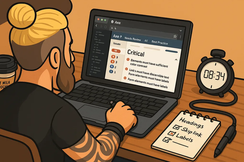
main,nav,footerand so on. Helps screen reader users jump about. - Colour contrast. If it’s hard to read, it’s probably not accessible. Use WAVE or Axe to check the contrast properly.
- Images have meaningful
alttext, or no alt at all if they’re just decorative. Right-click and Inspect to check.
Tools I Use
Bit of a mix. Some extensions. Some hands-on checks:
- Axe DevTools – highlights issues straight in the browser. Good for quick wins.
- WAVE – handy for missing labels and dodgy structure.
- NVDA with Chrome – free screen reader. Fire it up and listen to how the page reads. Does it make sense?
- Just the keyboard – ditch the mouse and see if you can get through the site. You’ll spot loads just doing this.
Things I Usually Catch
These crop up all the time:
- No skip link, or one that’s hidden or broken
- Buttons or links without any name (or just “click here”)
- Headings faked with
divs and styled to look right - Forms with no labels or feedback that doesn’t read out
- Modals that don’t trap focus or get announced to screen readers
Quick Wins
Only got time for a couple of fixes? Start with these:
- Add a skip link and make sure it works
- Give every button and link a proper name
- Sort the headings out so they make sense
That alone will make a big difference.
Final Note
This isn’t full testing, but it’s enough to catch most of the obvious stuff. Do it often and you’ll save yourself grief later. Doesn’t take long, and it means more people can actually use what you’re building.