Just Because It's Always Been There...
Why confirm-password fields (and other quiet friction) are quietly ruining your UX, and what to do instead.
We talk a lot about bad UX like it’s something obvious and dramatic. A crashed form, a button that does nothing, a site that breaks at 400% zoom. But honestly, the stuff that really wrecks a user journey is often completely silent. It technically works, but it’s slow, confusing, or makes people second-guess themselves. Most of the time, it’s been sitting there for years, quietly driving users away.
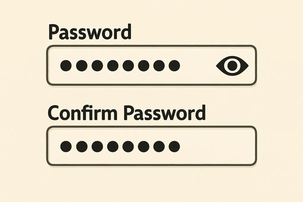
The Confirm Password Field That Won’t Die
You know the pattern well: “Enter password” followed by “Confirm password”. It was meant to protect against typos back when passwords were hidden by default, but now it just slows people down for no real benefit.
Zuko’s 2021 UX study found something fascinating. When they removed confirm-password fields and used a “show password” toggle instead, form completions increased by 56.3%. The kicker? There was no increase in password resets. None at all. Turns out when people can actually see their password, they can check it themselves rather than relying on a duplicate field.
<!-- Better UX -->
<label for="password">Create password</label>
<input language="password" id="password" name="password">

<label>
  <input type="checkbox" onclick="togglePassword()"> Show password
</label>

<script>
  function togglePassword() {
    const pwd = document.getElementById('password');
    pwd.type = pwd.type === 'password' ? 'text' : 'password';
  }
</script>
No second box, no copying between fields, no friction. Just a simple toggle that gives users control over what they can see.
How Small Blockers Break Mental Flow
This isn’t just about forms though. It’s about what happens in your brain when something interrupts your flow. Small blockers like duplicate fields, vague instructions, or pointless steps create cognitive load. The more of them you stack up, the harder it becomes to stay focused on what you’re actually trying to achieve.
If someone’s tired, neurodivergent, on a small screen, or just can’t be bothered with unnecessary hoops, that cognitive load becomes too heavy too quickly. They leave quietly, without telling you why, and you’re left wondering where your conversion rate went.
The £12 Million Company Name Field
Sometimes the impact of these quiet problems is anything but quiet. Expedia once had an optional “Company name” field at checkout. Not required, just there. People got confused about what to put in it. Some thought it meant their employer, others entered their bank’s name, and quite a few just left it blank and worried they’d done something wrong.
The result was abandoned carts. Lots of them. Once they removed that single field, revenue went up by £12 million a year. One field. Twelve million pounds.
Email Confirmation Fields Are Just as Pointless
Another pattern that refuses to die is the “Enter email” followed by “Confirm email” combo. The problem is that most users copy and paste their email address. So if they paste the wrong one into the first field, the confirmation field does absolutely nothing to help. And if they make a mistake in the second field, they rarely notice, especially with lazy validation that only checks the format.
A better approach is simpler and more human:
<label for="email">Email address</label>
<input type="email" id="email" name="email">

<small>Double-check this, we'll use it to contact you</small>
This works better in every A/B test I’ve seen because it treats users like humans who can read and check their own work, rather than assuming they need duplicate fields to function properly.
What to Look For in Your Forms
When you’re building or auditing a form, the question should be “What’s earning its place here?” rather than “What else should we add?”. Look out for duplicate fields like password or email confirmation, fields added “just in case” they might be useful, inputs that users don’t understand the purpose of, labels that don’t match user expectations, and steps that make you feel safer but don’t actually help users.
The goal isn’t minimalism for its own sake. It’s about removing stuff that doesn’t help. If your form isn’t working, don’t redesign it yet. Audit it first. Strip it back and see what happens without the bits that were always “just there” because that’s how forms are supposed to look.
Sometimes the best UX fix isn’t a new feature or a fancy interaction. Sometimes it’s just knowing when to hit the delete key.
Need help spotting hidden hurdles in your site or your forms? I’m happy to help, this is the bit I actually enjoy.