The Popover API
The browser now knows what a popover is. Here's what that means for your accessibility, your JavaScript, and the custom overlay code you've been maintaining.
TL;DR
The Popover API gives the browser a native understanding of transient UI elements like menus, disclosure panels, and interactive overlays. Keyboard dismissal, focus restoration, top-layer behaviour, and assistive technology relationships are handled by the browser when you use declarative popover controls. You still write some JavaScript, but you’re no longer compensating for a platform that had no idea what your UI element was.
There’s a certain kind of frontend code that no one enjoys maintaining. A popover, menu, or disclosure panel that works, mostly. Until a screen reader user hits it. Until someone presses Tab too fast. Until a keyboard user can’t close it because you forgot to wire up Escape.
You fix one edge case and introduce another.
Most of that code exists because the browser had no idea what those elements were. It saw divs. You taught it to pretend.
The Popover API changes that.
What it actually does
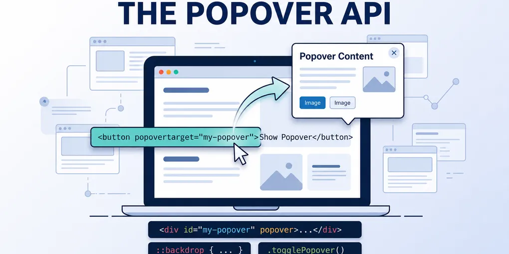
Add the popover attribute to an element and the browser stops treating it as a generic container. It gets placed on the browser’s top layer, above everything else in the document. No z-index battles, no stacking context surprises.
Wire a button to it with popovertarget and the interaction is set up declaratively:
<button popovertarget="action-menu">Actions</button>

<div id="action-menu" popover="auto">
  <ul>
    <li><a href="/edit">Edit</a></li>
    <li><a href="/delete">Delete</a></li>
  </ul>
</div>
No event listeners. No state tracking. The browser understands the relationship between trigger and panel without you spelling it out in JavaScript.
The old approach for a comparable interactive overlay: roughly 60 lines of JavaScript across five event listeners, with ARIA state kept in sync by hand. The new approach: about 10 lines of HTML and zero event listeners for the core interaction. (Smashing Magazine, March 2026)
Where the accessibility wins actually come from
The code reduction is welcome. But that’s not the real argument.
The real argument is that the browser now owns the behaviour, which means the browser is responsible for getting it right. And it does.
Keyboard dismissal. Press Escape and the popover closes. You didn’t wire that up. The browser understands that popovers are dismissible, so it handles it without a keydown listener.
Focus restoration. When a popover closes, focus returns to the trigger. For popover="auto" that’s platform behaviour — no trigger.focus() in your close handler.
Top-layer placement. Because the element sits on the native top layer, you avoid the usual z-index and stacking-context mess. More importantly, when you use a declarative trigger, the browser can expose a clearer relationship between the button and the popover to keyboard and assistive technology users.
Assistive technology relationships. With a declarative popovertarget button, the browser exposes the expanded and collapsed state to assistive technology. It doesn’t write an aria-expanded attribute into your HTML — if you’re controlling the popover with custom JavaScript rather than a declarative invoker, you still manage that yourself. But for the common pattern of a button wired to a popover via popovertarget, the relationship is handled without you maintaining it by hand.
One developer who migrated from a library-based implementation found that Lighthouse stopped flagging ARIA state warnings entirely after switching — because there were no longer custom ARIA states to accidentally get wrong. (Smashing Magazine, March 2026)
What JavaScript still does
JavaScript doesn’t disappear. It changes job.
Before, you were using JavaScript to compensate for what the browser didn’t understand: opening the element, closing it, managing focus, syncing ARIA, handling keyboard events. Recreating things the platform should have owned.
After, you use JavaScript for intent. A delay before hiding so the panel doesn’t vanish when the cursor clips the edge. Hover behaviour that distinguishes deliberate focus from accidental drift.
let hideTimeout;

const hide = () => {
  hideTimeout = setTimeout(() => {
    panel.hidePopover();
  }, 200);
};
That’s a different kind of code. It’s expressing a product decision, not papering over a platform gap.
The two modes
popover="auto" — includes light dismiss. Click outside or press Escape and it closes. Only one auto popover can be open at a time. The browser handles focus restoration on close.
popover="manual" — you control open and close. Escape doesn’t automatically dismiss. Focus restoration is explicit. Right for cases where you need precise control over the interaction model.
For most menu and disclosure use cases, popover="auto" with declarative invoker commands covers the bulk of what you need.
What it doesn’t fix
Simple hover tooltips. If you need a non-interactive tooltip that appears on hover and contains only text, the Popover API is more than you need. That pattern is better served by aria-describedby pointing to a simple tooltip element that appears on hover or focus, or by a CSS-only approach where the content remains properly associated with the trigger. The Popover API is designed for interactive overlays that need layer management — menus, disclosure panels, toggletips with links or actions inside them.
Positioning. The Popover API places the element on the top layer but doesn’t position it relative to the trigger, handle viewport edges, or flip when there’s no room. CSS Anchor Positioning is now the natural partner here — it became Baseline Newly Available across Chromium, Firefox, and Safari in early 2026, so for most layouts you can anchor a popover to its trigger entirely in CSS. For complex multi-container scenarios or heavy legacy support requirements, Floating UI still makes sense.
Large design systems. If you’re maintaining a toolkit used across multiple teams with a well-established library, switching has organisational cost. The API gives you better defaults, but it still assumes you understand when to add roles, when to manage focus explicitly, and when to test with an actual screen reader.
The decision
Use the Popover API when you want correct, maintainable behaviour without owning what the browser can now own for you. Reach for a library when you need complex positioning, or you’re managing consistency across a large team with existing patterns.
The default has shifted. For the first time, the simplest implementation is also the most correct one.
If you’re sitting on custom popover or menu code, pick one component. Just one. Drop in the popover attribute, wire the button, delete the event listeners, and see what doesn’t break.
That’s usually where it starts.