EmilyUI
A component-level design system for accessible public sector sites. Works with plain HTML, Astro, Vue, and Drupal.
EmilyUI is a component-level design system for accessible public sector sites. It works with plain HTML, Astro, Vue, and Drupal, including the kind of real-world frontend work where you don't always get a clean greenfield stack, a controlled build pipeline, or the luxury of choosing your own tools.
It has three layers: EmilyCSS handles design tokens and base styles, EmilyUI is the component library built on those tokens, and EmilyJS covers lightweight, no-dependency JavaScript behaviours for things like toggles, accordions, and focus management. Each layer is usable on its own.
Named after my daughter, Emily. Read why I built it →
EmilyCSS
The foundation layer. One config file defines your entire visual system — colours, spacing, type scale, radius, shadows, transitions — and EmilyCSS generates the custom properties and utility classes from it. No framework required.
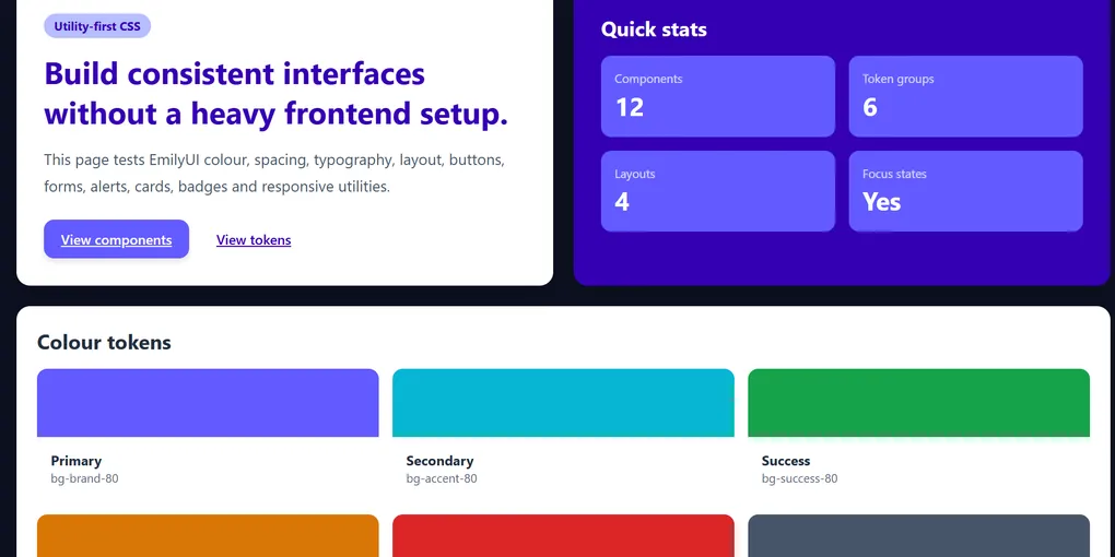
Colour Tokens
Defined once in emily.config.json. Used everywhere as CSS custom properties.
Type Scale
13 steps from xs to 9xl. Line heights baked in.
xs / 12px The quick brown fox sm / 14px The quick brown fox base / 16px The quick brown fox lg / 18px The quick brown fox xl / 20px The quick brown fox 2xl / 24px The quick brown fox 3xl / 30px The quick brown fox 4xl / 36px The quick brown fox Spacing Scale
Based on a 4px base unit. Aliased from --space-1 through --space-96.
--space-1 4px / 0.25rem --space-2 8px / 0.5rem --space-4 16px / 1rem --space-6 24px / 1.5rem --space-8 32px / 2rem --space-12 48px / 3rem --space-16 64px / 4rem --space-24 96px / 6rem Border Radius
radius-sm 4px radius-base 8px radius-md 12px radius-lg 16px radius-xl 20px radius-2xl 24px radius-full 9999px EmilyUI Components
Component patterns built on EmilyCSS tokens. Semantic HTML first. Accessibility baked in. No framework required — they're just HTML and CSS.
Buttons
<button class="emily-btn emily-btn--primary">Primary</button>
<button class="emily-btn emily-btn--secondary">Secondary</button>
<button class="emily-btn emily-btn--ghost">Ghost</button>
<button class="emily-btn emily-btn--danger">Danger</button>
Status Badges
Alerts
Cards
Component Card
A basic content card. Works in any HTML environment — Drupal, Astro, static templates, wherever you can write markup.
Bordered Variant
Cards can carry status badges, CTAs, or just content. Same structure, different states.
Form Controls
EmilyJS
Lightweight JavaScript behaviours with no dependencies. The point is the same as EmilyCSS: small, portable, works without a build pipeline.
Components currently in development:
- Toggle — show/hide with accessible ARIA state management
- Accordion — expand/collapse with keyboard support
- Focus trap — for modals and drawers
- Tabs — keyboard-navigable tab interface
- Toast — accessible live region notifications
Each behaviour is a single function or web component. Drop in what you need, ignore the rest. No global state, no framework coupling, no bloat.
Configuration
One file controls the entire design system. Change it, rebuild, done.
// emily.config.json (simplified)
{
  "colours": {
    "brand": "#E05C00",
    "accent": "#2563EB",
    "success": "#017F65",
    "warning": "#FFC107",
    "error": "#B20000"
  },
  "spacing": {
    "scale": { "1": "0.25rem", "2": "0.5rem", "4": "1rem" }
  },
  "typography": {
    "fontSizes": [
      { "name": "base", "value": "16px", "lineHeight": 1.6 },
      { "name": "xl", "value": "20px", "lineHeight": 1.6 }
    ]
  },
  "breakpoints": {
    "sm": "640px",
    "md": "768px",
    "lg": "1024px"
  }
}
Run npx emily-css build and the config generates:
- CSS custom properties for every token
- Utility classes for background, text, border, spacing, radius, shadow
- A manifest JSON for tooling integration
How to Use It
In any HTML project
Drop in the stylesheet and start using the classes:
<link rel="stylesheet" href="emily.min.css" />In Astro or Vue
// astro.config.mjs
import emilyCss from 'emily-css';

// Or import directly in your layout:
import 'emily-css/dist/emily.css';
In Drupal or Liquid templates
Add the stylesheet to your theme's CSS files, reference the tokens via custom properties in your existing CSS:
/* your-theme.css */
.my-component {
  color: var(--color-brand);
  padding: var(--space-4);
  border-radius: var(--radius-base);
}